Skip to content
Motionbar
Sign inStart free
Brand guide

How Motionbar looks
when it is not in a hurry.

The working system, not a moodboard. Every value here matches the master files — five lockups, four colourways, and a bar geometry that never gets redrawn by hand.

SVG · PNG · JPG · AITagline: Dynamic Workflow SuiteType: Sora + Instrument Serif
Motionbar — Dynamic Workflow Suite

The lockups

Five lockups cover every placement. Pick by the space you have, not by preference: if the name must be legible, use a lockup that contains it; if it cannot be, use the logomark alone.
Primary
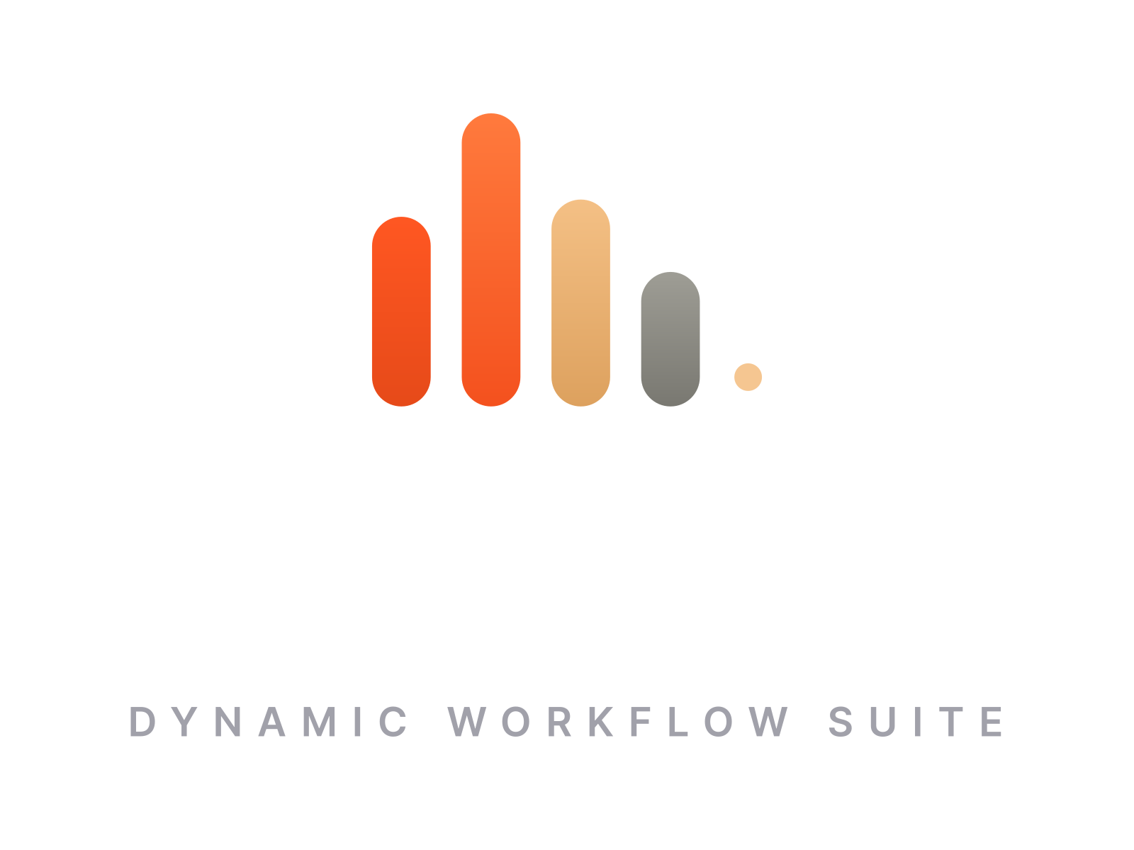
Primary

The full signature — logomark, wordmark and tagline. Site header, decks, letterhead, anywhere the brand introduces itself.

2400 × 720 · 10:3
Horizontal
Horizontal

Same lockup without the tagline. App chrome, nav bars, email signatures, partner footers.

2400 × 600 · 4:1
Stacked
Stacked

Mark over name, for narrow or square spaces — sidebars, merchandise, print columns.

square-ish
Wordmark
Wordmark

Name only. Use when the logomark already appears nearby, or in a row of partner wordmarks.

wide
Logomark
Logomark

Mark alone. Avatars, favicons, app tiles, loading states, watermark corners.

1024 × 1024 · 1:1

Colourways

Four per lockup. The choice is made by the background, and only by the background.
Dark
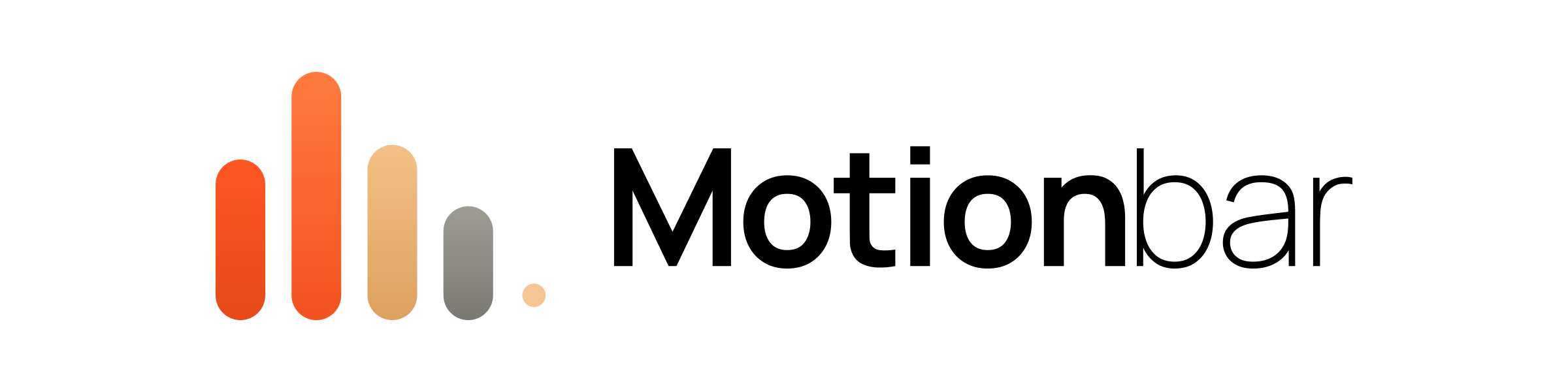
Dark

Colour bars, white wordmark. Ink and any dark ground. The site default.

Light
Light

Colour bars, black wordmark. Bone, white and any light ground.

White, mono
White, mono

One ink. Photography, video overlays, embroidery, single-colour print.

Black, mono
Black, mono

One ink, reversed. Newsprint, stamps, laser etch, faxable documents.

Logomark geometry

Four pill bars and a dot. The bars are fully rounded — the radius is always half the bar width, never a fixed number. Heights, pitch and the dot are locked; scale the whole mark, never a part of it.
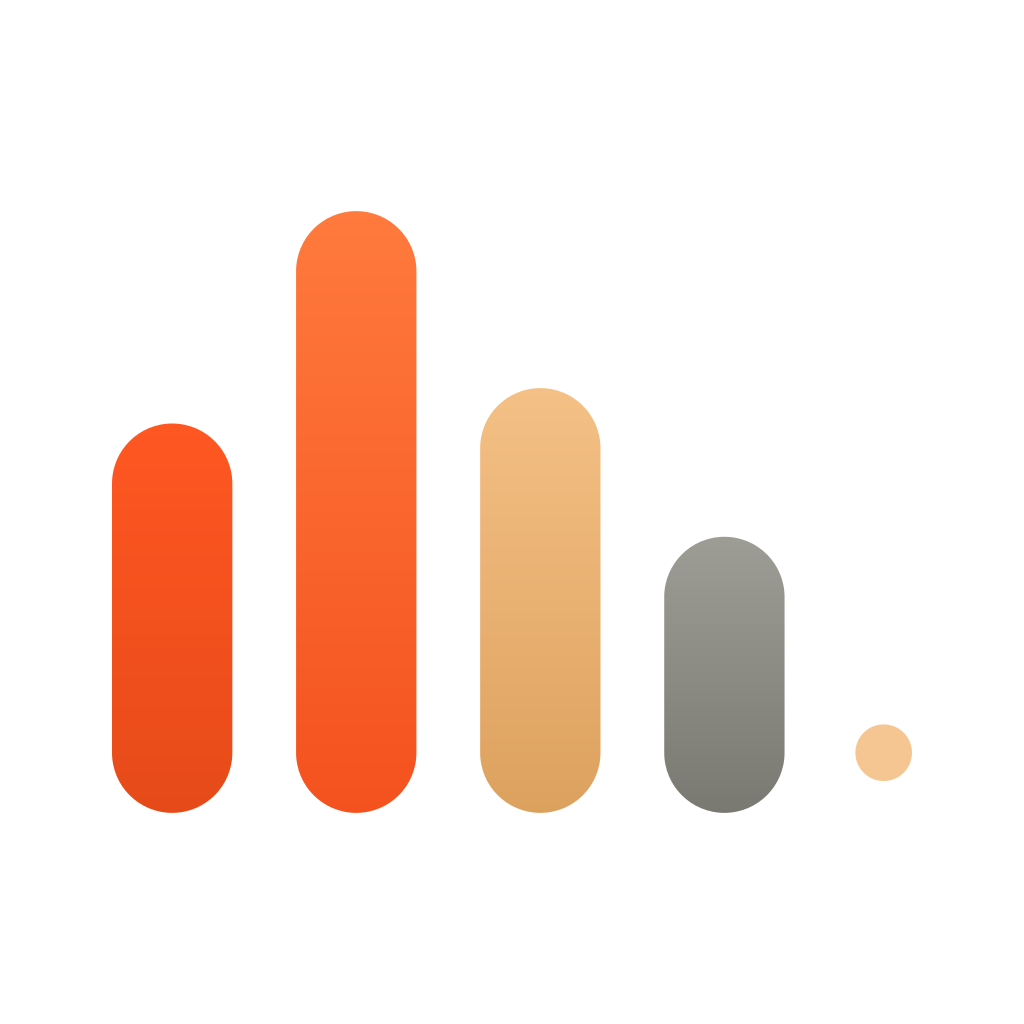
Motionbar logomark
bar heights65 / 100 / 71 / 46 %bar width20 % · radius 10 %pitch30.6 % · gap 10.6 %dot radius4.7 % · diameter 9.4 %dot offset11.8 % from bar 4
Bar heights65 / 100 / 71 / 46 percent of the mark height. The second bar is always the peak.
Bar width20% of mark height, equal on all four. Radius is half the width, so the ends are true semicircles.
PitchCentres sit 30.6% of mark height apart, leaving a 10.6% gap. The gap never closes to make room for type.
Accent dotRadius 4.7% of mark height — 9.4% across — gold at 90% opacity, on the fourth bar's lower third. It is the decay tail, not a fifth bar.
GradientsEach bar carries its own vertical gradient, lighter at the top. Flat fills belong to the mono colourways only.
Never redrawUse the SVG. Rebuilding the mark from CSS boxes loses the pill ends and the gradients.

Misuse

Every one of these has turned up in the wild. Using the master SVG prevents all of them.

×Do not recolour the bars. The four gradients are fixed.
×Do not stretch, skew or rotate the mark.
×Do not square the ends of the bars.
×Do not reorder the bars or drop the accent dot.
×Do not add glows, shadows, strokes or bevels.
×Do not place the mark on a busy or mid-tone photograph.
Motionbar
×Do not set the wordmark in another typeface or in all caps.
by2026
×Do not crowd the lockup or hang type off it.

Colour

Each bar owns a gradient; the interface uses their top stops as flat tokens. Ember is the only colour allowed to shout and appears on roughly one element per screen. Gold means money and credits. Stone is secondary text. Ink and bone carry everything else.

Ember

Primary action. Bar one.

var(--ember) → #e64a19 oklch(64% 0.21 39)
Ember light

Bar two, the peak. Hover and highlight.

#ff7a3d → #f4511e oklch(71% 0.18 42)
Gold

Credits, billing, premium. Bar three and the dot.

var(--gold) → #dda15e oklch(83% 0.08 71)
Stone

Secondary text, inactive states. Bar four.

var(--mute) → #797871 oklch(67% 0.01 95)
Ink

Page ground, and the icon tile at #09090b.

var(--ink) oklch(14.5% 0 0)
Bone

Primary text and light surfaces.

var(--cream) oklch(95% 0.017 90)
Tagline grey

Tagline only, light colourway.

#71717a oklch(54% 0.02 286)
Ember wash

Hero and CTA grounds only.

two radial gradients over var(--panel-warm)
Bordersrgba(cream,.10) hairlines. .14 on inputs, .20 on secondary buttons.
ContrastBody text sits at 4.5:1 minimum. Never set stone below 13px on ink.
RatioRoughly 70% ink, 22% bone, 5% stone, 3% ember and gold combined.
Mintvar(--mint) signals verified and operational in the interface. It is not a brand colour and never appears in the logo.

Type

Sora does the work. Instrument Serif italic appears once per page at most, on a single word inside a headline, and never below 32px.

DisplayClone once64/1.02, 600, -0.035em
HeadlineFour rooms, one twin40/1.08, 600, -0.03em
SectionWhat things cost24/1.2, 600, -0.02em
BodyThree photos and two seconds of audio make a twin.15/1.7, 400
UI labelGenerate13/1.4, 500-600
MicroCREDITS11/1.4, 600, 0.12em caps
Accent serifvideoInstrument Serif italic 400

Voice

Motionbar sounds like a competent operator who has done this a thousand times and is not impressed by it. Short sentences. Concrete nouns. A dry joke that earns its place, never two in a row.

Specific over grandSay “rendered in 0:52”, not “lightning fast”.
Verbs, not adjectivesThe twin talks, sells, ships. It is not “revolutionary”.
Honest about the machineIt is generated video. We say so, in the copy and in the file.
No hype vocabularyNo “unleash”, “supercharge”, “game-changing”, “seamless”.
No exclamation marksOne per year, and it had better be an outage apology.
WE WRITE
Clone once. Shoot forever.Your next forty videos are already in your face.Failed renders are refunded automatically.You can only clone a face you are allowed to clone.
WE DO NOT
Unleash the power of AI video!Revolutionising content creation, one video at a time.Your all-in-one seamless solution for modern creators.Welcome to the future of storytelling.

Icons, social and email

The logomark on the ink tile, nothing else. The wordmark never appears in an icon.
FAVICON
favicon.svg + .ico
16 · 32 · 48 · 96 · 512
APP ICON
1024² square and rounded
apple-touch 180 · chrome 192 / 512
AVATAR
mark at 52% of the circle
400 × 400 master
Open Graph card
Open Graph card

1200 × 630, dark and light. Every page ships one — a link preview without it looks broken.

SIZES ON FILE
Profile avatar400 × 400X header1500 × 500LinkedIn banner1584 × 396Facebook cover851 × 315YouTube banner2560 × 1440Open Graph1200 × 630

Use the SVG.
Never redraw the mark.

SVG · PNG · JPG · AI, in every lockup and colourway. Press enquiries to press@motionbar.ai.